
WrittenRealms
A captivating text-based adventure game.
Realistic graphics nowadays can keep most gamers entertained for countless hours, but there is a niche of gamers who prefer old-school, text-based interactive games—and WrittenRealms is here to prove it. Thibaud envisioned the product as a personal, passion-driven project—and it is been a beautiful ride.
First contact
The game had potential and its early users loved it, but most of them agreed on one thing: the design was barely usable. So, Thibaud went on a hunt for a designer to level up the user experience of his beloved game—and that is how I entered the picture.
Iterating with Roy on the design has helped me achieve a greater understanding of my own product, clarifying in each component the goals of the platform and streamlining how users experience the game.
Breaking it down
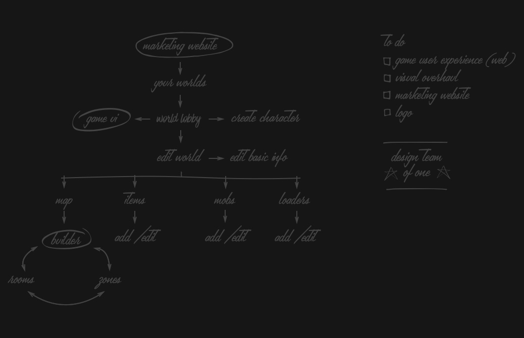
There is no ideal way to start a design process, but something is always key: knowing your medium.
After I went over the game back and forth for a while, we sat down with Thibaud for an in-depth conversation about how the product got to where it was and where it was going.
We agreed that things were messy, and there was a strong desire to redefine the entire user experience from scratch and give it a charming new look.
Designing for gameplay
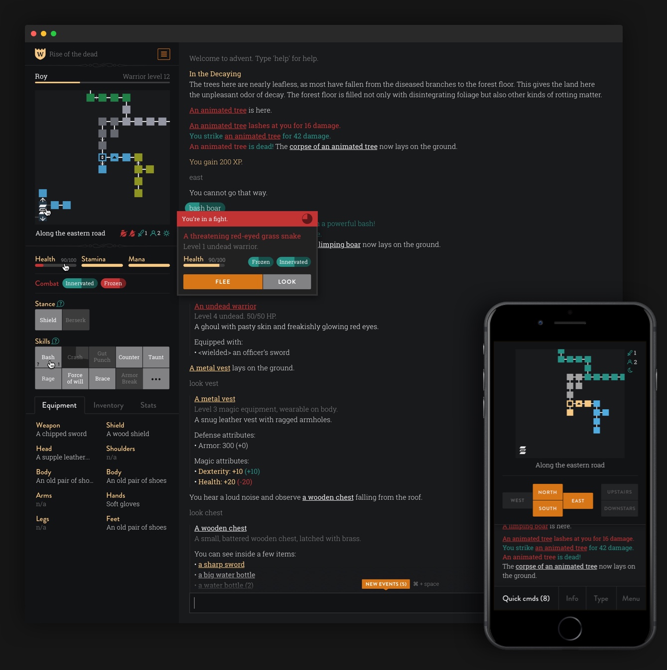
The web in-game interface allows players to perform all the actions they can do through the console but in an efficient and easier to access way. We took into consideration dozens of different status, actions, and interactions that needed to be compacted into a tiny sidebar.
For the console itself, we took special care of text readability and went even further by applying different visualization methods on specific types of content.
Designing for conversion
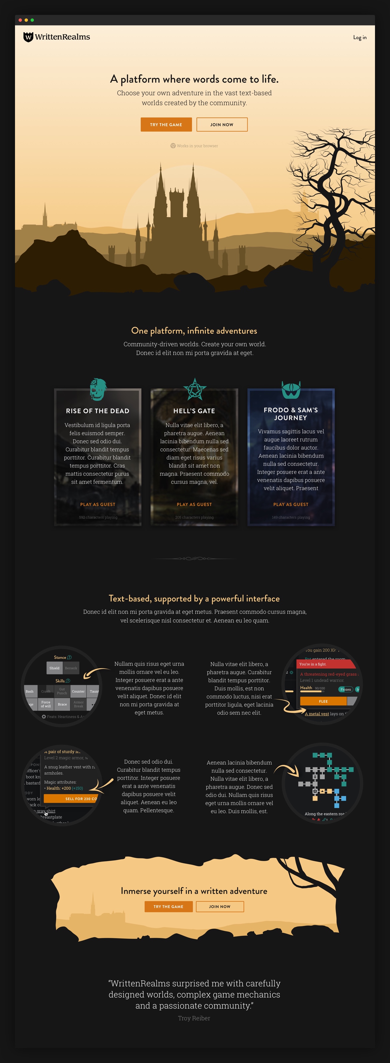
For converting visitors into players, we decided to go for a single-page website that is simple and straight to the point. And, for the content strategy, we focused on highlighting the features that make the game unique and implemented an attractive visualization around it.
Designing for creativity
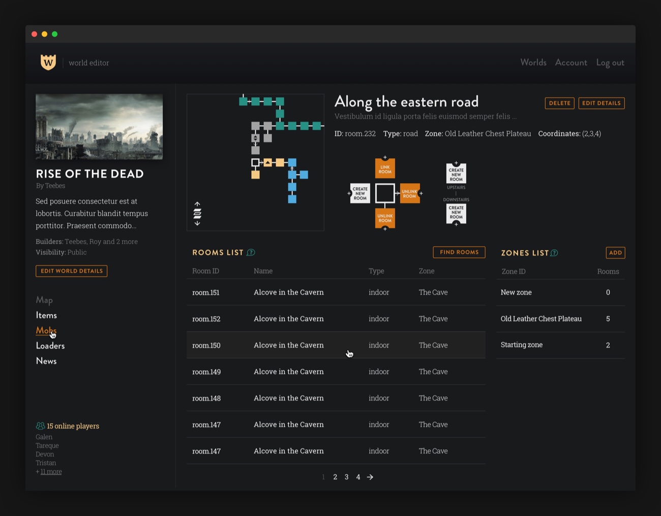
One of the first challenges was to redesign the world builder, a crucial part of the product where the gameplay is ideated, so creativity must be encouraged but it is constrained by the platform capabilities. Allowing just the right amount of settings and using smart defaults were essential to design an environment of seamless creation.
Catching the eye
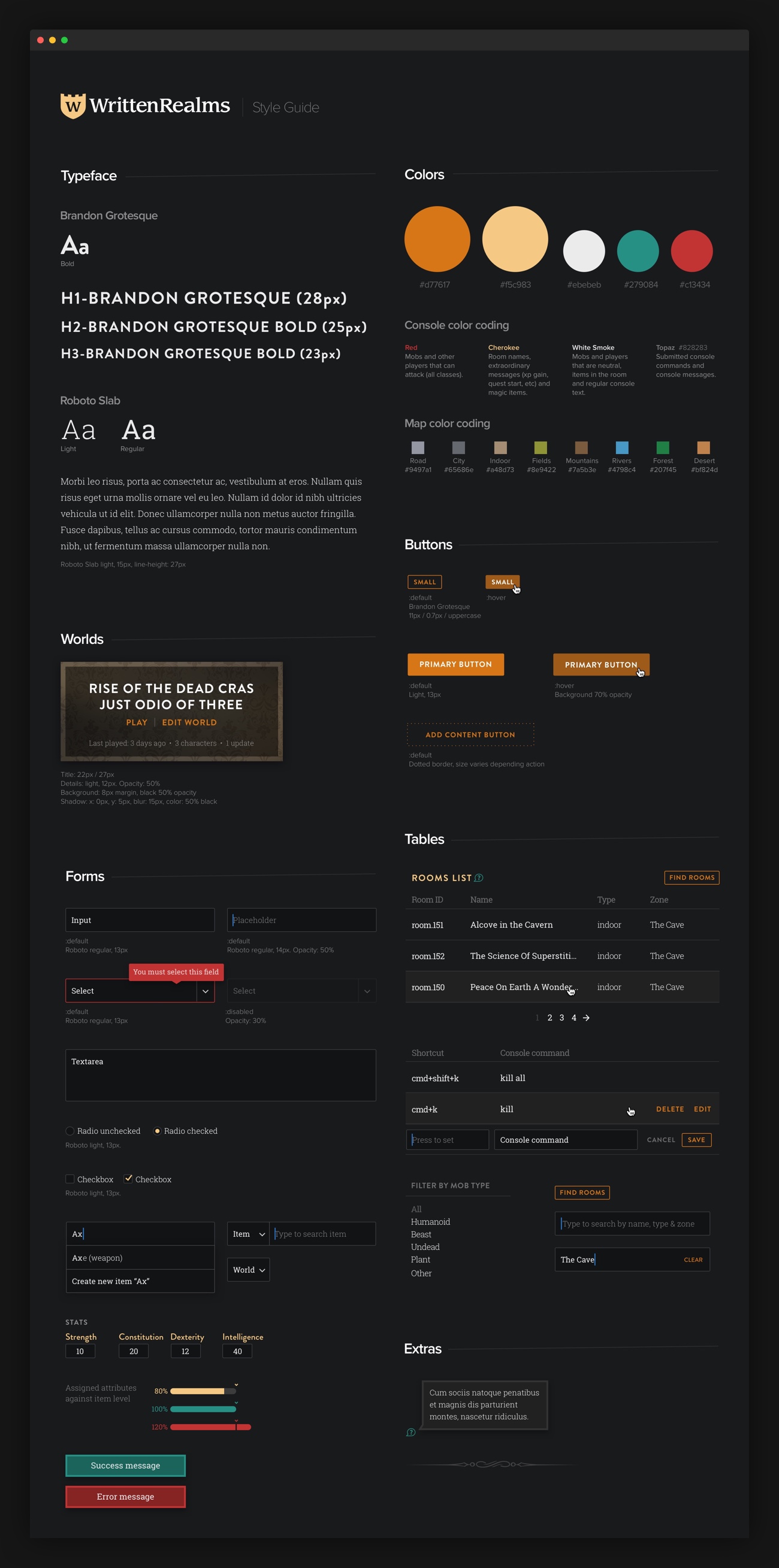
The goal of the visual style phase was to convey fantasy and playfulness yet still maintain an old-school feeling. We used vibrant, attention-catching colors, a strong, playful font for headlines, and a matching slab, geometric body copy font to achieve a natural reading rhythm.
As the visual design started to build complexity, the need for guidelines became clearer; and the style guide took the form of dozens of different elements, states, and text styles.
Try the game at writtenrealms.com.