TravelApp
A visual tracker of where you had been.
One year of continuous travel and an increasing number of countries visited sparked the idea of mapping out the places I'd been on the planet—and it sounded pretty fun. I explored the concept further and ideated an app based on it.
Learning from the market
With a vague concept in mind, the research started by discovering and analyzing existing apps to determine if something similar existed, and if it did, gather new ideas.
A dozen apps later and even though there were similar products, none fit what I had in mind, so it was worth it to continue the process.
To help me shape and differentiate the product, I created a chart of the most popular apps in the space, including primary features and rating specifics that were helpful for the process.
| Hello World | Mark O’Travel | Visited | |
|---|---|---|---|
| App Store | |||
| Rating | 4.5 (9) | 4.8 (151) | 3.9 (100) |
| Recently updated | Yes | Yes | Yes |
| Business model | Limited wishlist ($1.99) and Limited Journal ($2.99) | Region maps (all $3.99, country-specific $0.99) | Free |
| Design | |||
| User experience | ★★★★ | ★★★ | ★★ |
| Visual design | ★★★ | ★★ | ★ |
| Features | |||
| Recommendations | No | No | No |
| Journal | Yes, based on entries | No | No |
| Social related | No | No | No |
| Wishlist | Yes, based on countries | Yes (tags like) | Yes |
| Import pins from photos | No | Yes | Yes |
| Segmented US States | No | Yes (paid) | Yes |
| Stats | Yes, continent-based | No | Yes |
| Sign up | N/A | N/A | Required |
Learning from travelers
As the product started to take shape, it was time to learn from other people's thoughts and validate my beliefs. I went on the hunt for real people to help me out, looking to understand their travel behaviors and desires when organizing their trips, while they are on it and afterwards, and gathering feedback and extracting ideas from there.
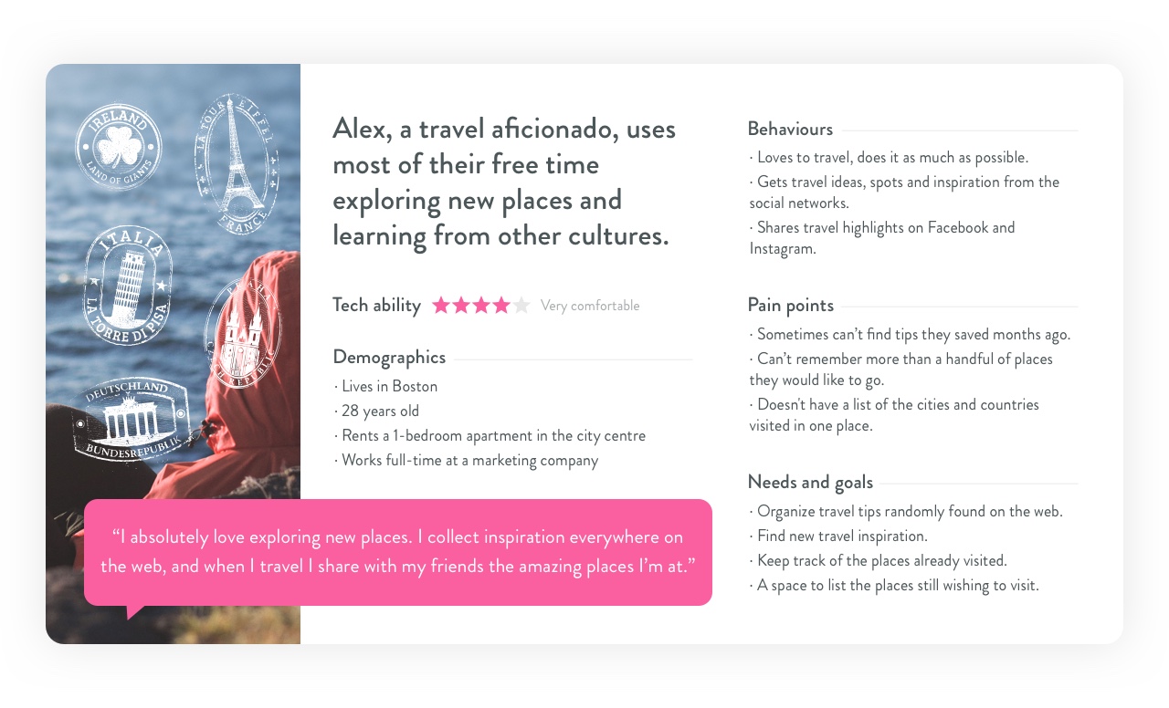
From the data collected, it made sense to create a persona to go back to and remind me who I was designing for in the upcoming design phases. The creation guidelines were to build it gender neutral, focus on behaviors, and display only information useful for the design process.

Rounding up the concept
At this point, what to build and to whom was vaguely defined, so I set basic product guidelines to help me define the exact features that the first version of the app should have.
- Mark where you'd been: an interactive map of the places you'd been focused on cities—instead of countries—to make suggestions and travels more granular and specific. We'll make it easier for you to import data from social networks and add visited cities manually.
- Inspire people to travel: a discovery section, where we'll give you suggestions for new cities to visit based on where you had been (e.g. if you love beaches, we might show you hot summer destinations. Or if you’ve never been to Asia, we'll push trendy cities of the season).
- A place to plan future trips: save cool destinations you want to go (from the places we suggest to you and from anywhere else), and save notes, restaurants, and websites about each destination.
The core concept started to feel more solid, and I was confident enough to start diving in the app user interface design.
User flows
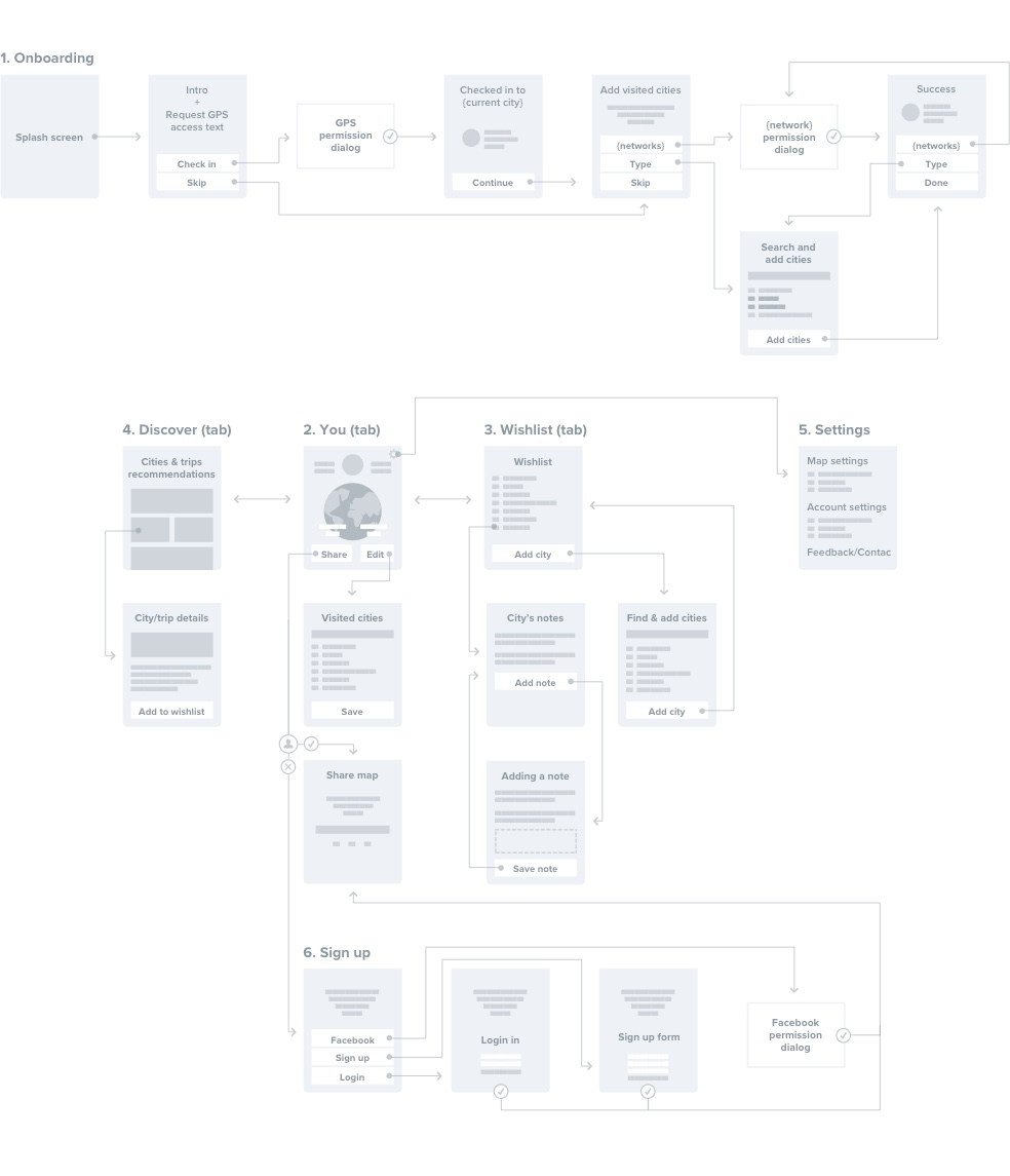
Once objectives and features were defined, I started focusing on solutions and laid out the app structure. This is a crucial step that makes the upcoming phases a lot easier because it puts everything decided so far on the table.

Exploring and sketching ideas
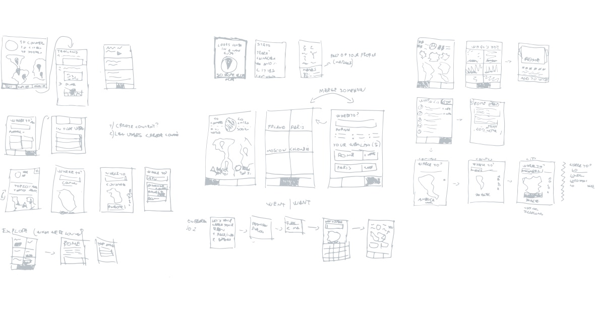
It was time to let the creativity express itself and begin to sketch ideas, focusing on ideating many different solutions for the interface problems at hand and then choosing the ones that worked best.

Wireframing + Prototiping
I created a digitalized, more refined version of the rough sketches in form of low-fidelity wireframes, focusing on user interface elements and how users interact with them. From there, an interactive prototype was built to play around with the progress made so far, and gather actual usage feedback.
Visual style
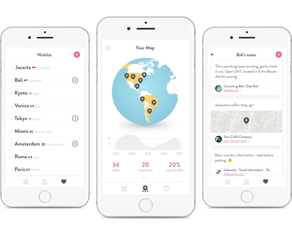
The last layer of the design process was focused on the personality, look, and feel of the app. I wanted to convey playfulness, while maintaining a light feel to it. The goal was to make it fun to play around with, inviting and evoking positive emotions.
